
The Story Behind Our Brand
When Cirrus celebrated its 20th anniversary in October 2022, we decided it was time to give our brand a refresh.
We wanted something that reflected the next generation of Cirrus under Elizabeth and Jahan, while staying true to our history, the lift industry and the relationships we've built along the way.
The result is the Cirrus brand you see today. And there's quite a bit of meaning behind it!
Why blue and grey?
We kept our original colours but gave them a brighter, more modern feel.
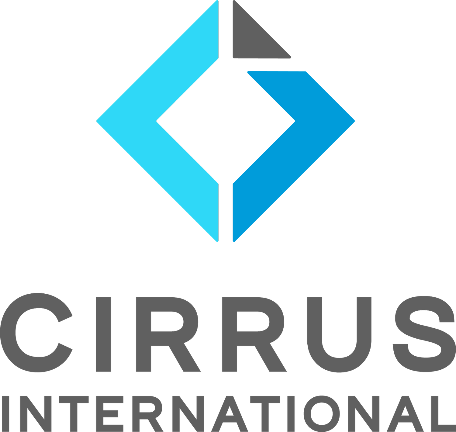
The grey reflects stainless steel, technology and the lift components we supply. The blue represents our friendly, professional approach and the cirrus clouds that inspired our company name.
There's a story behind our logo, too
At first glance, it's a simple geometric symbol, but look a little closer.
The arrows represent both the past and the future, as well as the movement of a lift going up and down and its doors opening and closing.
The square represents a bird's-eye view of a lift car, while the triangle in the top right symbolises positivity and the future.
And there's one detail that's particularly special to us.
The white lines form an 'L' for Laurie, our founder. The triangle is also deliberately a little asymmetrical, a small nod to Laurie's personality that those who knew him will appreciate.
Looking forward, remembering where we started
Our brand reflects how Cirrus has evolved over the years, bringing new people, products and technology into the business while holding on to what matters.
We're proud of where we've come from, and it's nice knowing that a little piece of Laurie is still part of the Cirrus story every time you see our logo.

