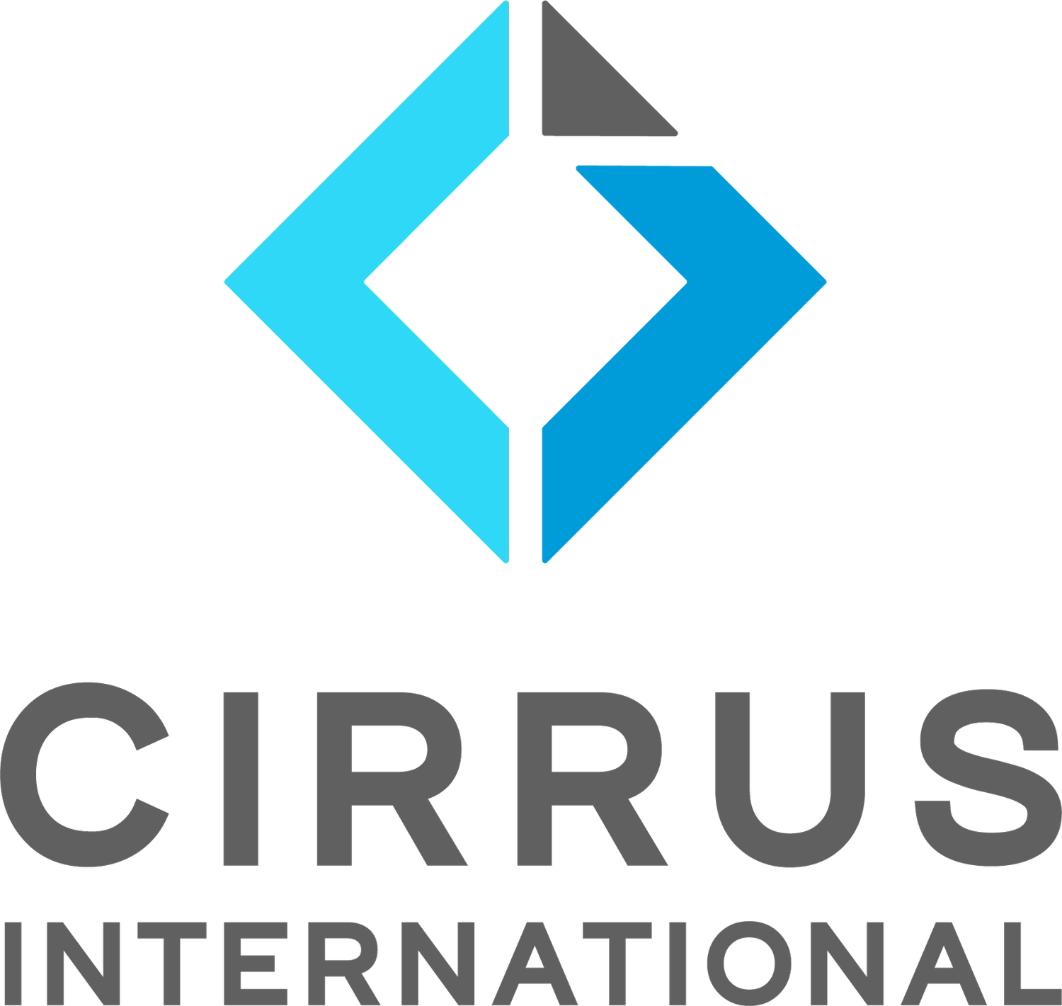
New Look Cirrus
To celebrate our 20 Year anniversary (October 2022) and because it was a bit overdue, we have been through the cool process of rebranding Cirrus!
We really wanted to take the existing brand and transform it into something a bit more modern and fresh, to represent Elizabeth and Jahan, but still honour our history and journey over the last 20 years. We also had to stay true to the industry and make sure the refreshed brand was something our customers and suppliers could relate to and identity with.
So, why Grey & Blue?
We wanted to stick with the existing calm colours but brighten them up a bit. The grey tones represent stainless steel, technology and the products we offer. The blue represents both our brand values of professional friendly service as well as the Cirrus cloud which is where the company name comes from.
And the symbol..what’s that about?
This element has tons of meaning packed into it! They are arrows representing the past and the Future, but also a lift going up and down, opening and closing. The square is a birds eye view of a lift car with the door opening. The triangle up the top right represents positivity and the future while the white lines around the triangle, are an “L” for Laurie. For those of you who knew Laurie, you would also appreciate the very slightly asymmetrical nature of the triangle, this is also our wee nod to him.
We hope you love it as much as we do!

